


Phosphor Touch Time Watch Review
/
You may know Phosphor as the brand responsible for numerous digital watches made with highly legible curved E-Ink displays with eye-catching punchy contrast, and large bold numbers. But Phosphor's latest watch release doesn't come with an E-Ink display. Instead of a paper-like ink display, Phosphor's new Touch Time watch utilizes a low-power always-on touch screen display that is so energy efficient it is powered using a regular ubiquitous coin-cell battery that can last a whole year without ever having to charge the device like a conventional wearable. And much like a Pebble smartwatch, the Touch Time is Phosphor's first touch-sensitive watch to integrate smartphone-esque apps and customizable watch faces. Sounds interesting, but is it as good as the Pebble at $159? Needless to say, we have put the Touch Time through its paces to find out if it's worth the asking price. So be sure to catch our full review down below!
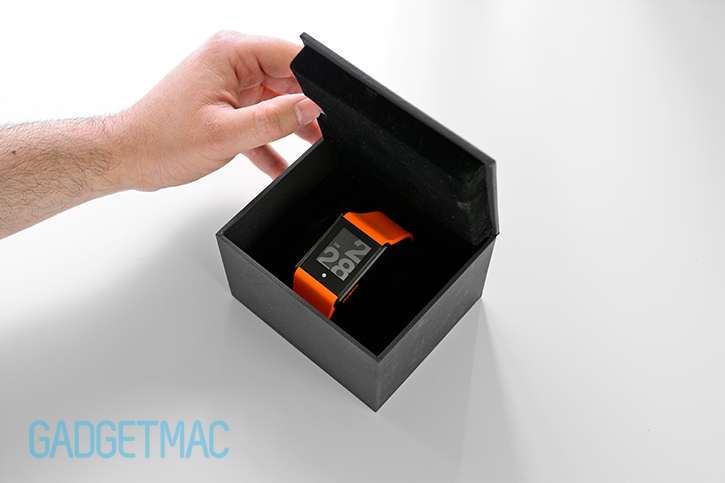
Starting from the very beginning, the Phosphor Touch Time arrives protected inside a hard box clenching a soft pillow like any self-respected watch would. Nothing else will wait for you inside apart from a user guide, and of course the watch itself - which already comes powered on and ready to for action.
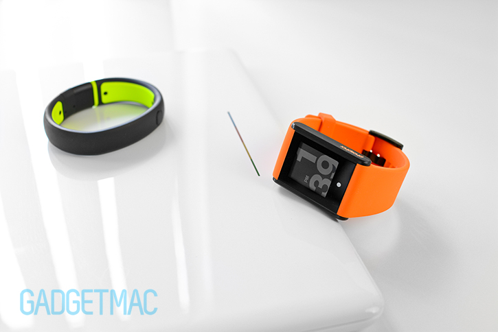
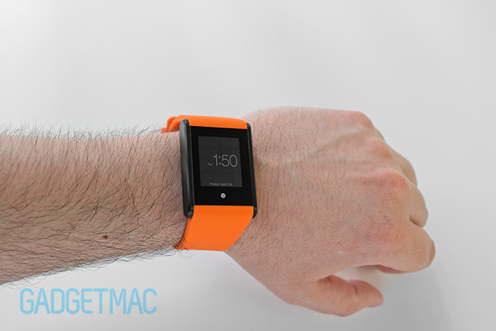
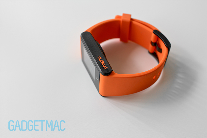
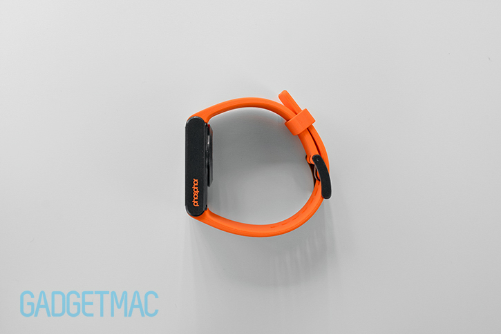
Phosphor's Touch Time comes in five different sporty silicone strap colors for $159, as well as in a more formal stainless steel strap version for $199. Phosphor says they've designed the Touch Time to be unisex, but we can see that being a problem if you're a female because of how large and hefty it is. We don't find the Touch Time's design to be particularly unique, though arguably it isn't a bad looking watch either. The rectangular shape of the Touch Time extends beyond the watch casing itself, and across to the wrist strap which is seamlessly paired to the metal casing whilst closely matching the gap-less width where the watch meets the strap. The end result is a watch with a uniformed and courteously mundane styling that shares a daintier likeness with Nike's SportWatch.

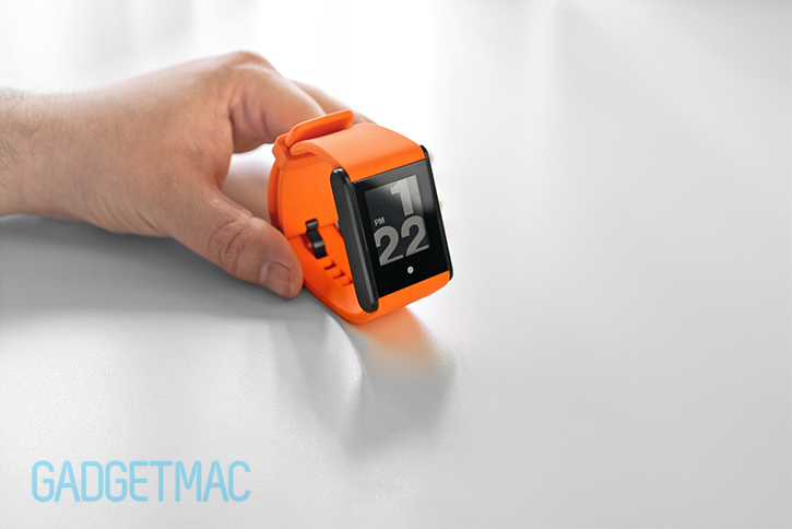
So what is the Touch Time exactly? At first glance we can see that it's clean all the way through, with no branding at the front except for a Phosphor logo engraved into the side of the metal bezel. There are no USB ports, no motion and accelerometer sensors or Bluetooth 4.0 wireless connectivity anywhere in sight. Just a normal water-tight battery compartment underneath where a coin cell battery powers the whole package for up to a year. Or so they say, because we obviously can't put the claim to the test.
So no, this isn't some type of smartwatch or a wearable device that will help you get fit and motivated throughout your day, whilst allowing you to detach from your smartphone yet still be connected to it as soon as you look at your wrist. It is, plainly, a digital watch with a touch screen. Nothing more, nothing less. So if that doesn't make your inner geek somewhat upset, you'll actually find that the Touch Time is quite a decent and unique watch. It offers what every other digital watch will also offer you, with the exception of novelty, though fairly easy-to-use touch controls and limited customizable watch face interface along with a long battery life, and an extremely legible E-Ink-like display. It's a bit of a shame that Phosphor missed the opportunity to enter the smart wearable market with the Touch Time, especially when you're already putting in the effort in integrating a capacitive touchscreen on your watch while making it obvious that your intentions were to smartify it with a smartwatch/iPod nano-inspired interface.
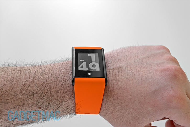
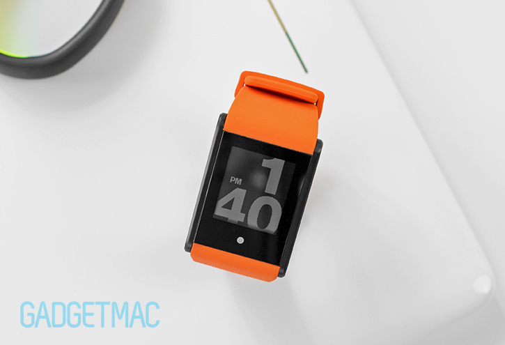
At the top, we have a small rectangular capacitive touch screen surrounded by a large bezel similar to the Pebble. Although it’s worth noting that unlike the Pebble’s curved plastic bezel and body, the entire surface of the Touch Time’s display and bezel is a single flat pane of glass similar to the higher-end Pebble Steel smartwatch. The Touch Time's small LCD display is less than 1.5-inches and packs the same relatively high resolution 144x168 pixels as the original Pebble. Tough unlike the Pebble and other Phosphor watches, the Touch Time's LCD display isn't an e-paper display technology so there is no refresh rate lag when interacting with the display. Because the Touch Time features a somewhat special type of LCD panel which is designed to be powered on all the time much like a liquid crystal display you'd find on most digital watches, the viewing angles are legible from virtually any direction. The only caveat is that the glass makes some angles more difficult to see from because of its reflective properties and quite significant gap between the display panel and the glass.
That's not to say that the Touch Time isn't as good as the Pebble when it comes down to displaying legible time and other pieces of information in any lighting condition. In fact, the Touch Time's display as as good as the Pebble even though the two aren't the made using the same technology. The more light there is, the better you see things being displayed on the Touch Time's screen. Think about reading an old fashioned news paper or a magazine for that matter, and how easier it is to read when you've good more light to work with it. When the sun sets, or when you find yourself in very low-light conditions, the Touch Time features a white backlight function that you can turn on for a few seconds. The display becomes evenly lit and just as perceivable in the dark of night thanks to the white LED backlighting.

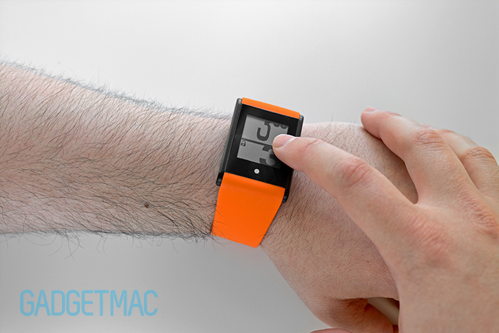
What looks like a mysterious little silver dot at the bottom of bezel is in fact a capacitive touch-sensitive button which serves two different function. And apart from look a bit out of place, it is a flush indicator that sits beneath the glass. Double tapping it will turn on the LED backlighting for a few seconds.
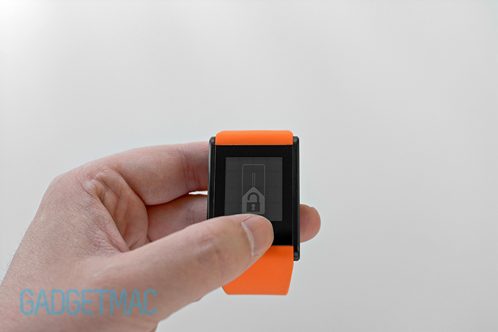
To ensure that not accidental touches will interfere with the Touch Time's touch screen when you're wearing it, the touchscreen automatically locks itself after a few seconds. In order to make any changes or use one of the features available on the Touch Time, you'll need to touch and hold that little dot until a slide-to-unlock button appears. Sliding your finger up will unlock the touchscreen and an unlock icon will appear at the top left side of the screen. Leaving the touchscreen untouched for a few seconds will lock it automatically. There are no physical buttons on the Touch Time, and really there's no need for any of them because using the Touch Time's responsive glass touchscreen to navigate around the watch interface is easy and dare I say, surprisingly intuitive.
The touchscreen for a device this small is surprisingly responsive and acceptably sensitive to input. It works great when navigating between the watch interface as long as you gently swipe your finger around the screen.Otherwise, rapid gestures will simply not register like they would on a smartphone touchscreen, and that's understandable. Even tapping on small objectives such a calculator keypad will have you think how impressive its touch screen capability is
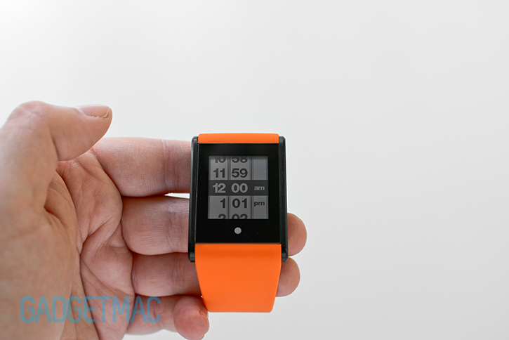
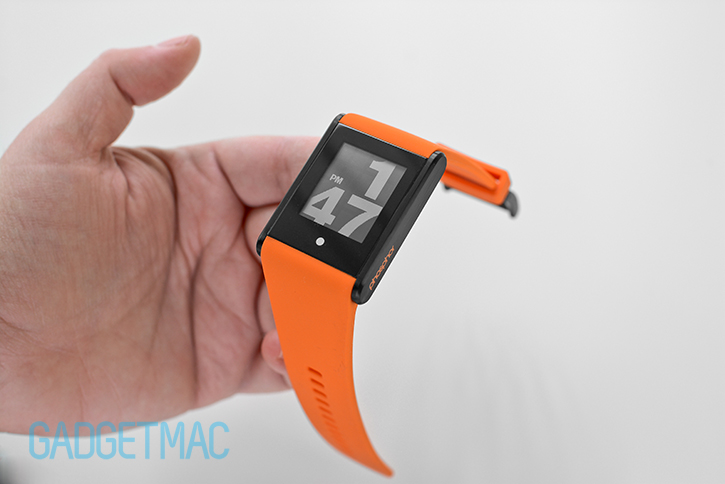
After you've unlocked the screen, you can immediately start to swipe up or down across the screen to change between different types of watch interfaces, or faces for short. Don't get your hopes high though, there are just 6 different designs and we think only one stands out. And that is the oversized digital watch face which is what I think best suits the design of the Touch Time itself. There are two arguably poorly designed analog style watch faces, a somewhat useful wold time face which displays three different time zones with the city initials beside it for those who travel around much. And if you're looking to mimic the detailed time displayed on your smartphone with the Touch Time, there's only one digital watch face which features a detailed date and time combination that while is the second most useful face on the entire watch, both the time and date are painfully small to read. It would have been great if Phosphor added more watch face options similar to the Pebble like the classy text time face which literally spells out the time for you.
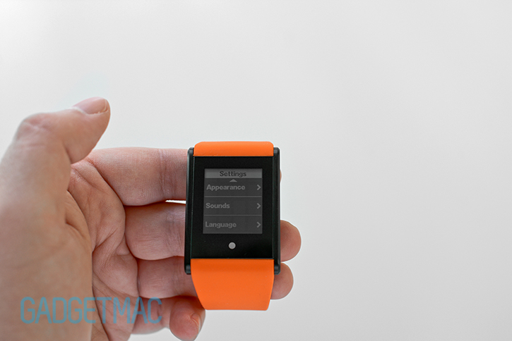
Going into the settings area is done by swiping to the left or right on the screen from the clock interface. There you'll be able to do normal things like adjust the time and set the date, as well as pick a language and turn on/off chime sounds. Lastly, there's an appearance setting which allows you to invert the display from a black background to a white colored background with black overlaid information, and vice versa. A use case scenario for this would be when you want to match the color of the bezel around the touchscreen to make it so that they blend nicely together. Again, the Touch Time is available in white or black colored bezels. Overall, the Touch Time's setting menu are easy enough to scroll through. Not that you'll find yourself doing so very often.
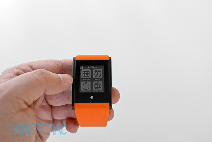

The Touch Time interface is split into three individual pages similar to Samsung's Gear smartwatch in that there is the default view that is your clock interface as well as two other pages with a grid of four icons that can be accessed by swiping sideways. It is clear that Phosphor felt compelled to put out a smarter-looking watch out into the market, but it looks like the company is trying to compete with smartwatches using a half baked digital touch-sensitive watch made to look more enticing and interesting as if it had actual apps built in.
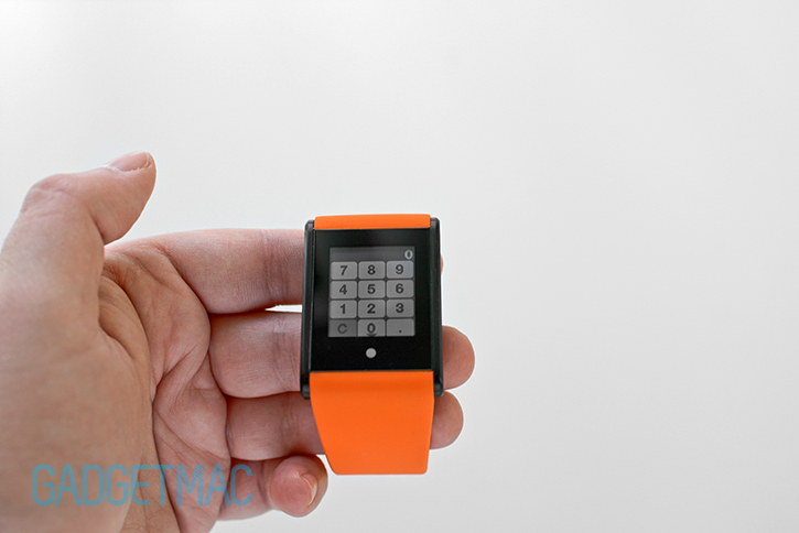
As Phosphor puts it, these are smartphone-like apps. But really they’re unpractical and just not good enough. A calendar app? Don’t you have that on your smartphone already? Not to mention a calendar that you can actually use to set specific events in. A stopwatch you say? Yes it works well, but it lacks a countdown timer. But what about the ability to set an alarm? If you’re preferred to go back in time where digital watches annoyed you with the same old high-pitched digitized beeping chime, then by all means go right ahead let the Touch Time’s alarm clock app handle waking you up in the morning to the tune of pure ear irritation.
Okay, maybe I’m being to harsh. Although you wouldn’t be much too happy to know that silencing that morning alarm clock chime is perhaps the most difficult thing you’d ever find doing first thing in the morning. Instead of making a snooze button and a deactivation button for the alarm feature, Phosphor decided that it would be smart to make a slide-to-unlock button to end the alarm instead. The orientation of the unlock button changes from its vertical position into a horizontal orientation for the alarm clock interface, which oddly enough makes it so that you cannot swipe sideways across the screen to essentially unlock and turn the alarm notification off. There's a snooze button right above it which works properly, but in order to turn the alarm off you need to awkwardly swipe up from the middle above the dot, and over the unlock button as you slide it to the side. It doesn't always work so you end up hitting the snooze button for another try. What were you thinking, Phosphor? It's another reason why you should stick to your trusty smartphone when it comes to using functions such as setting an alarm, using a calculator and setting calendar events and reminders.
The Touch Time is built using the same materials you’d find on a high-end smartwatch minus the tough Gorilla Glass - like stainless steel and a smooth glass touch screen. Yet it doesn’t feel premuimly built nor spec actual. The glass doesn't have an oleophobic coating or other anti-reflective properties so fingerprints immediately show up as soon as you touch it. But honestly the display is still very easy to see even though the glass is somewhat reflective. The stainless steel casing is very sturdy and gives the watch an excellent, robust build quality. Meanwhile, the brushed metal finish adds a brilliant touch of detailing. Having said all that, the Touch Time is no Samsung Gear when it comes to premium build quality and surface finish. Granted it costs half as much, so it's to be expected.

When you start to looking for the advantages over a regular digital watch such as a trusty Casio G-Shock, the picture becomes much clearer. It is far and away obvious that the Touch Time’s oversized digits atop of its ePaper-like LCD offers a much more visible and legible method of reading the time. Granted a G-Shock is built to last a lifetime through rugged heavy usage. It’s an entirely different beast, whereas the Touch Time is a more delicate and modern proposition thanks to its updated approach to wearable time keeping.
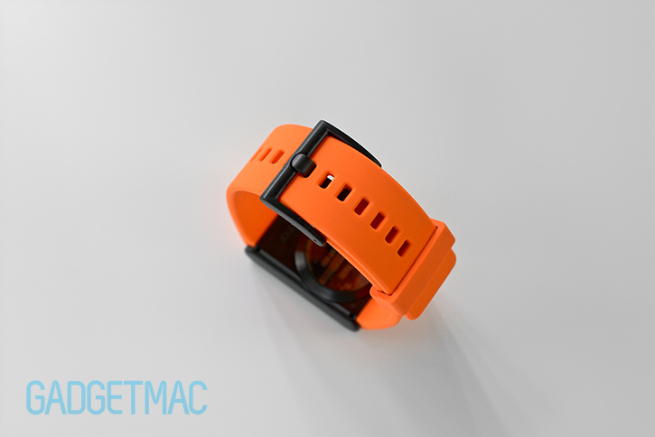

Our Touch Time model came with an orange silicone strap which as we quickly came to find, attracts more lint and debris than a normal watch strap does. Speaking of normal, say G-Shock polymer straps, this silicone one just feels childish and not premium at all. It’s a flimsy, albeit thick silicone that could potentially stretch with use. The otherwise smooth silicone material should have been micro texturized to prevent it from attracting stuff to it and becoming too tacky and foreseeably less durable. I will say however, that this strap does feel soft against the skin and quite comfortable without causing any discomfort to hairy wrists, but at the same time it’s too soft and just underwhelming.
You can of course adjust the strap to comfortably fit your wrist, while leftover strap can be tucked using the standard band retaining loop. It's also worth noting that instead of using plastic or a more rigid from of silicone rubber, the strap buckle is also made out of metal and matches the color of the stainless steel watch casing that it comes with.
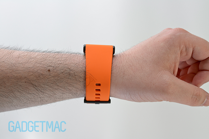
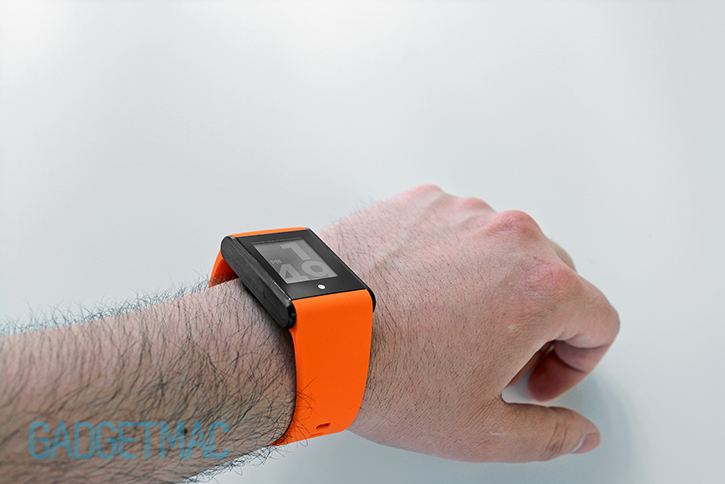
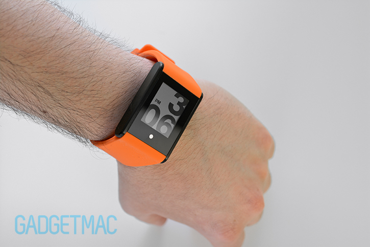
What is a wrist watch worth if it doesn't seamlessly fit into your lifestyle? Not much. After wearing the Touch Time for a couple of days I came to a short conclusion: it's heavier than it should be, but still pleasant to wear. That silicone strap is very soft and provides a smooth and comfortable experience. That said, I think that the stainless steel construction of the watch itself is thick and weighty. So if you're used to lightweight watches or not having to wear a watch at all, the Touch Time will take getting used to unlike much lighter and more petit wearables worn on the wrist. It does not have a low-profile design so it predominantly sticks out when you're wearing it. Whether that's a good or bad thing is of course a matter of personal preference, but I don't think that it should be this bulky considering the hardware limitation.
While I didn't mind wearing the Touch Time throughout my day, the wide silicone strap and thick rectangular stainless steel casing were a nuisance at the end of the day. I wouldn't want to wear this watch personally. It isn't particularly good looking, serves a more useful purpose compared to other regular watches, nor is it refined enough for me to consider wearing it let alone paying the full $159 asking price. And when you combine that with the fact that the Touch Time is merely a simple digital watch with little to offer, I'd rather stick to my smartphone and on occasion, my higher-end Tag Heuer Formula 1 Grande Date; an arguable proper timepiece. I would, however, consider using a Pebble Steel instead of the Touch Time if I were to look for an affordable watch that could actually give me more convenience for the price.
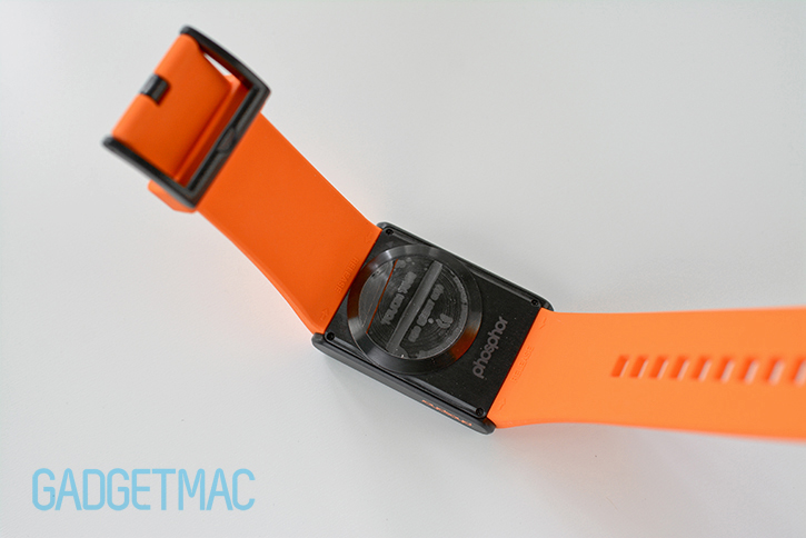
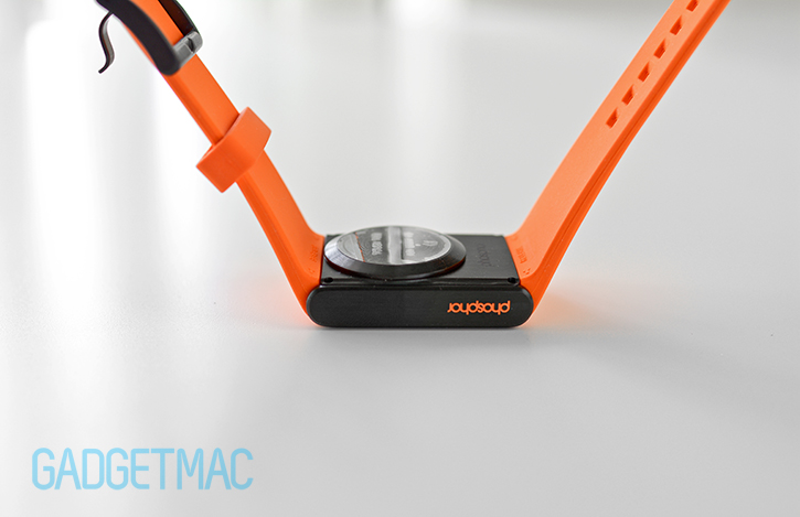
That hump underneath you see there is the metal water-tight battery compartment cover for the watch. Presumably you'll only have to twist and open it to replace the inexpensive CR2450 coin battery inside once a year. And even though it seems like it would feel weird when wearing the Touch Time, but it's actually not noticeable once you wear it. It does however add more bulk because how its increased protrusion above the otherwise flat underbelly watch casing, which we obviously think is unnecessary and without finesse.
Of course, and it goes without saying, there are a lot more useful things that you can do with the $150 Pebble watch compared to the Touch Time. The two tell time, and they do that very well. But when considering the price tag, the original Pebble is a more attractive option with a bunch more features, apps and a wider variety of unique watch faces which you can download for free using an app on your smartphone. We don’t believe Phosphor has done enough to justify the price or even offer a compelling product that will entice consumers to jump all over it.
We don’t see this as being a match for a similarly priced wearable device such as the Pebble smartwatch or even the Nike FueldBand SE. We don’t think the Touch Time’s faux smart watch appearance and poor excuse for “apps” merits any kind of praise. However, we will say that the always-on LCD display is impressively sharp and is capable of being extremely legible in any condition, and that we do like the brushed stainless steel casing and rather responsive touch screen interface. The battery life is decidedly the best and most impressive thing about the Touch Time, and there's no arguing with that. And while it's true that you get a lot more for your money with a Pebble smartwatch, you will need to charge it at least one a week in comparison. If you're still only looking for a unique watch to wear that you'll never have to think about charging, considering one of Phosphor's curved E-Ink watch offerings.
Phosphor should have put in more effort to make a watch that offered more than just a different way of interacting with how it functioned. For starters, there should be more appealing interchangeable clock faces, a larger display and less bezel or some form of smartwatch DNA thrown in because after all, 2014 is the year of sophisticated wearables.